Time Travel (Web)
Above is a picture of the Time Travel control in its simplest state.
Normally when you open an ARDI product, the control will be set to 'live', showing you the data as it comes in.
However, the control can also be used to look at a range of time, and compare points in history against one-another.
Choosing A Time
When you click on the black square, a new menu appears, allowing you to change the focus of the report to another point in history.
Live returns the chart to showing the latest data.
Event allows you to pick an event (ie. batch number #2295, afternoon shift on 20/2/2015 etc.) to view.
Calendar opens up a calendar so you can pick a specific date and time to view.
Choosing a Range
If you’d like to look at more than one instant in time, you’ll need to choose a range. By clicking the range button, both a second date box and a menu will appear.
As above, Calendar lets you pick a date and time to act as the end of your range.
Event allows you to choose from your list of events
Recent allows you to pick from some common date ranges, such as ‘Today’, ‘Yesterday’ etc.
Once you’ve selected the time, your charts will update.
Please be aware that…
- If you choose a time that occurs before your current start time, then the time you’ve selected will become the new start, and the existing start time will become the end.
- If you’re running “Live” and choose an end date, it will become the new start date and the current time will become the end date.
Comparing to Another Time
You can compare one instant or one range of time to another, using the compare button.
When you click the compare button, you’ll be given the same options as when clicking the range button. The only difference is that your reports will now show extra, dotted lines to show the measurements made at the chosen time.
Above you can see a chart of two very stable values – the solid line represents the top range (0:00-23:59 on 1/11/2016) while the dotted line represents the bottom range (15:00-14:59 on 7/9/2016).
Changing Contexts
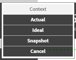
At the top of the Time Travel control, you may see a context button. This button is only available if your ARDI site is making use of the context feature.
Before we cover its use, we will discuss what a context is.
In some cases, there may be different places for ARDI to find values for your properties. For example, a plant might have a model or a simulator that predicts how your system should operate, and you’d like to see those values instead of your live ones.
You could also have taken a ‘snapshot’ of your plant when it was in ideal working condition, and you’d like to look at those values – and more importantly, compare them against the current state of the system.
By changing your context, you can choose between these sources of information. This means you can easily create a chart that details the state of your system against an ‘ideal’ state, or a ‘dangerous’ state that you’ve recorded earlier, or find out close your model was to the real-world.
You can change the context separately for both the upper and lower parts of your comparison.


