Compare
The Compare addon is designed to visually compare assets behaviour over time.
It compares either two assets, or one asset across different times.
Unlike trend charts, this type of comparison works even when the two time-frames are dissimilar (ie. when you're comparing a 10-minute time frame against a 30-minute time frame).
Below, you'll find some examples…
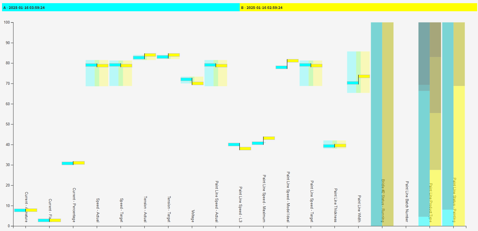
Comparing Machine Performance Across Times
Note - please be patient - it takes a while to build the complete chart, as it loads data in stages.
Reading the Comparison - Analogue Values
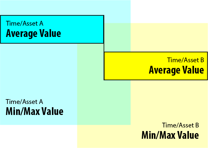
Once fully loaded, each analogue value will be shown with four key areas.
The fully opaque rectangles show the average value of the channel, with the light-blue side being the first asset/time and the yellow being the second.
The transparent rectangles show the min and max value of the channel through the time. Any areas where they mix in the middle will be shaded green.
All values are shown in the percentage of their range, which allows you to visualise every point on the same Y axis, even if their actual unit values are vastly different.
Reading the Comparison - Discrete Values
Any discrete values are shown as 0-100% stacked bar charts, showing the percentage of time the asset spent in each state.
For example, a valve that opens and closes continually would show as 50% open, 50% closed.
You can hover your mouse over any items for more information.
Configuration
The Compare addon does not require any configuration.

