Asset Shape UI
When you click on an Asset Shape test in FirstSite, you'll be taken to a web page that looks like the one below…
Test Results
At the top of the page are your test results, showing you if the asset is running in an unusual way.
In most cases, you want this to be either white (not yet trained) or green (OK).
Unlike most other types of test, Asset Shape UIs require training before they can begin to work.
If you're logged into ARDI as an Administrator, you can do this using the This Is Normal button, which records the current values as new training data for the Machine Learning system.
Chart
The chart below the test results is an illustration of the 'shape' that the AI sees.
In many cases, this chart is not human readable. It contains a mix of many different types of data, re-scaled to be between 0 and 1 (a process called normalisation).
It's simply provided to help you visualise the job that the AI is performing behind-the-scenes.
Closest Match Summary
Machine learning algorithms are terrible at explaining why they give you the results they give.
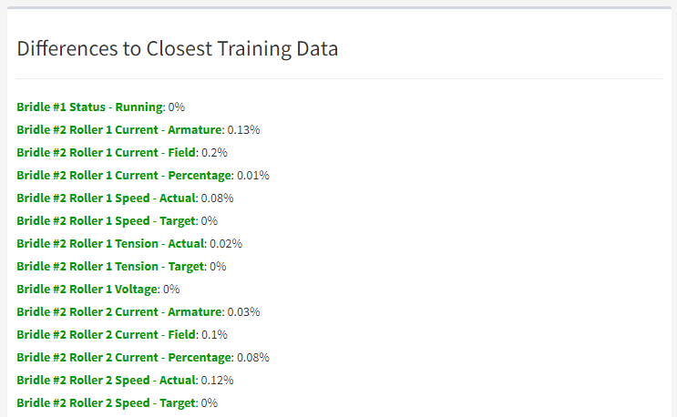
To help understand why you're getting certain results, you'll find a list at the bottom of the page that shows you the difference between each of your properties and the closest overall match that could be found in your training data.
In some cases, this can help you see which property is causing the AI to decide the asset is abnormal.

