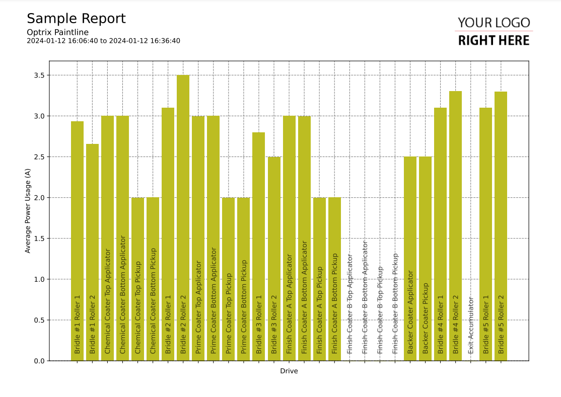
Basic Vertical Bar Chart
This code sample of a vertical bar chart report.
It shows the average value of a single property across multiple assets. It uses a relationship to define the order that the assets appear in across the X axis.
Asset names vary wildly in terms of length. Because of this, we suggest placing your asset names inside the report rather than placing them on one of your axes.
Customising
| Element | Replace With |
|---|---|
| [ASSET] | The asset you want to start with |
| [RELATIONSHIP] | The relationship that defines the order of the assets |
| [PROPERTY] | The name of the property you want to report on |
| [MEASUREMENT] | The name of the measurement (ie. Temperature) |
| [UNIT] | The units the measurement is in |
The Code
import os
import sys

sys.path.insert(0,os.path.dirname(os.path.dirname(__file__)))

import mplreport
import datetime

@mplreport.ardireport("Sample Report")
def CreateReport(report,args):

    #Create a page containing a single plot.
    fig,ax = report.CreatePage(1)

    #Print a title block for the page.
    report.Title()

    #Our AQL query goes here
    query = "'[ASSET]' ASSET '[RELATIONSHIP]' RELATIONSHIP 'downi' RELATED ('[PROPERTY]') PROPERTY VALUES"

    #Get the pandas data-frame with the results.
    df = report.GetHistory(query)

    #Draw the bar charts
    ax.bar(range(0,len(df.columns)),df.mean())

    #Draw in names
    indx = 0
    for col in df.columns:
        ax.text(indx - 0.18, 0.1, col.replace(" [PROPERTY]","").strip(), rotation=90, c=(0,0,0,0.7))
        indx += 1

    #Clear the X axis
    ax.set_xticks(range(0,len(df.columns)))
    ax.set_xticklabels([""] * len(df.columns))

    #Set the minimum Y value to 0
    ax.set_ylim(0)

    #Clean up and prettify
    ax.set_xlabel("[RELATIONSHIP]")
    ax.set_ylabel("[MEASUREMENT] ([UNITS])")
    report.Grid(ax)

    #Save this report out.
    report.Save()
