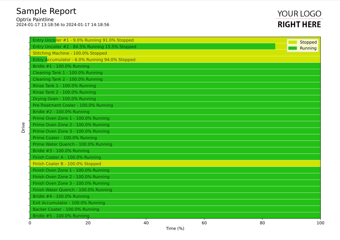
Summary Horizontal Bar Chart
This code sample of a horizontal bar chart report.
Horizontal bar charts are ideal when you want to show a discrete value (such as an on/off or open/closed/transitioning status) over time.
In this case, we're showing a summary of how much time across the report range that the various assets were in different states.
Asset names vary wildly in terms of length. Because of this, we suggest placing your asset names inside the report rather than placing them on one of your axes.
Customising
| Element | Replace With |
|---|---|
| [PROPERTY] | The name of the property you want to report on |
| [ASSETTYPE] | The title to show on the Y axis |
The Code
import os
import sys

sys.path.insert(0,os.path.dirname(os.path.dirname(__file__)))

import mplreport
import discretepatterns as dp
import pandas as pd
import datetime

@mplreport.ardireport("Sample Report")
def CreateReport(report,args):

    #Create a page containing a single plot.
    fig,ax = report.CreatePage(1)

    #Print a title block for the page.
    report.Title()

    #Our AQL query goes here
    query = "('[PROPERTY]') PROPERTY ALLPOINTS"

    #Get the pandas data-frame with the results. Use the extended version that includes metadata.
    hist = report.FetchHistory(query)
    df = hist.data

    #Use the 'Discrete Patterns' class to convert discrete data into
    #  time frames
    patterns = dp.DiscretePatterns()
    patterns.SetDataframe(df)
    patterns.Ready()

    #Establish a preferred order for the values
    order = [1,0]

    #Calculate total report time
    totaltime = (report.defaultend - report.defaultstart).total_seconds()

    #An array of asset names and summaries
    summaries = []

    #Draw the bar chart
    indx = len(df.columns)-1
    for col in df.columns:
        #Convert a discrete value into a set of time frames
        frames = patterns.GetAllTimeframes(col)

        #Get both colour and value maps
        map = report.GetDiscreteColourMap(hist,col)
        vmap = hist.GetValueMap(col)

        #We'll summarise the different values here...
        txt = ""

        #Go through the different values in the specified order
        realtotal = 0
        for n in order:
            #Calculate the total time spent with this value
            total = 0
            if n in frames:
                for frame in frames[n]:
                    total += (frame[1] - frame[0]).total_seconds()

            #If there's anything to show...
            if total > 0:
                #Convert the total into a percentage...
                total = (total / totaltime) * 100
                #Draw the total
                ax.broken_barh([(realtotal,total)],(indx,0.9),color=map[n])
                realtotal += total

                #And update the line of text
                if txt != "":
                    txt += " "
                txt += str(int(total*10)/10) + "% " + vmap[n]

        #Add the asset name to the line of text, and add it to the list.
        txt = col.replace(" [PROPERTY]","") + " - " + txt
        summaries.append(txt)

        indx-=1

    #Draw in names
    indx = len(df.columns)-1
    for col in summaries:
        ax.text(1, indx+0.18, col.strip(), c=(0,0,0,0.7))
        indx -= 1

    #Clear the Y axis
    ax.set_yticks(range(0,len(df.columns)))
    ax.set_yticklabels([""] * len(df.columns))

    #Clean up and prettify
    ax.set_ylabel("[ASSETTYPE]")
    ax.set_xlabel("Time (%)")
    ax.margins(0,0)
    legend = report.GetDiscreteLegend(hist,df.columns[0])
    ax.legend(handles=legend[0])

    #Save this report out.
    report.Save()
