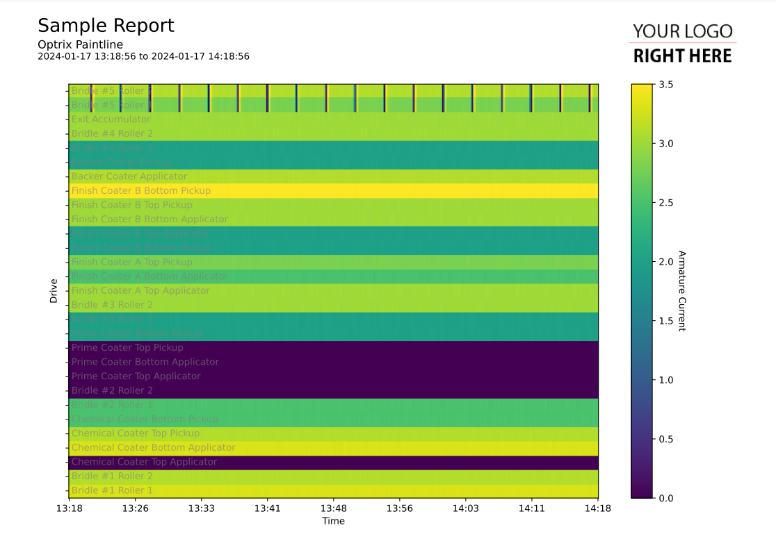
Basic Heatmaps
This code sample of a heatmap report.
Heatmaps are used when you have three dimensions of data (often asset, value and time) to display, and there are too many individual items to use a line chart.
While you can use fixed colour tables like viridis with your heatmaps, these reports use the metadata that is included with your AQL query to create colour maps that suit your properties, and return the minimum and maximum values associated with those colour maps.
Customising
| Element | Replace With |
|---|---|
| [ASSET] | The name of the asset to start with |
| [RELATIONSHIP] | The relationship that is used to create the Y axis |
| [PROPERTY] | The name of the property you want to report on |
| [MEASUREMENT] | The name of the measurement (ie. Temperature) |
| [UNIT] | The unit of measurement used |
The Code
import os
import sys

sys.path.insert(0,os.path.dirname(os.path.dirname(__file__)))

import mplreport
import pandas as pd
import datetime

@mplreport.ardireport("Sample Report")
def CreateReport(report,args):

    #Create a page containing a single plot.
    fig,ax = report.CreatePage(1)

    #Print a title block for the page.
    report.Title()

    #Our AQL query goes here
    query = "'[ASSET]' ASSET '[RELATIONSHIP]' RELATIONSHIP 'downi' RELATED '[PROPERTY]' PROPERTY VALUES"

    #Get the pandas data-frame with the results.
    hist = report.FetchHistory(query,samples=500)
    df = hist.data

    #Get a colour map, minimum and maximum value from the column information
    map = report.GetAnalogColourMap(hist,df.columns[0])

    #Draw the heatmap itself
    im = ax.imshow(df.T,cmap=map[0],interpolation='nearest',aspect='auto',vmin=map[1],vmax=map[2])

    #Draw a reference scale
    cbar = ax.figure.colorbar(im, ax=ax)
    cbar.ax.set_ylabel("[MEASUREMENT] ([UNIT])", rotation=-90, va="bottom")

    #Draw in names
    indx = len(df.columns)-1
    for col in df.columns:
        ax.text(2,indx+0.18,col.replace(" [PROPERTY]","").strip(), c=(0.5,0.5,0.5,0.6))
        indx -= 1

    #Clear the X axis
    ax.set_yticks(range(0,len(df.columns)))
    ax.set_yticklabels([""] * len(df.columns))

    #Clean up and prettify
    ax.set_ylabel("[RELATIONSHIP]")
    ax.set_xlabel("Time")
    ax.margins(0,0)
    report.HeatMapTimeAxis(ax.xaxis,500)

    #Save this report out.
    report.Save()
