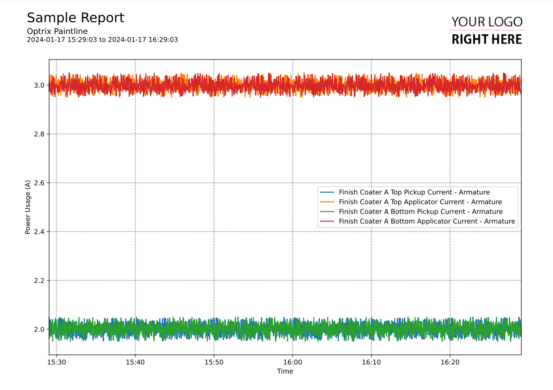
Line Graph of One Property on Related Assets
This code sample of a line-graph report.
It shows the value over time of a single property (ie. Temperature), across a number of assets. These are presented in the order they appear across a relationship (for example, in numerical order, or the order they start up in).
Customising
| Element | Replace With |
|---|---|
| [STARTING ASSET] | The name of the asset the sequence starts from |
| [RELATIONSHIP] | The relationship to follow |
| [PROPERTY] | The name of the property you want to report on |
| [UNIT NAME] | The name of the units (ie. Temperature) |
| [UNIT] | The actual unit of measurement (ie. Deg C) |
The Code
import os
import sys

sys.path.insert(0,os.path.dirname(os.path.dirname(__file__)))

import mplreport
import datetime

@mplreport.ardireport("Sample Report")
def CreateReport(report,args):
    #Create a page containing a single plot.
    fig,ax = report.CreatePage(1)

    #Print a title block for the page.
    report.Title()

    #Our AQL query goes here
    query = "('[ASSET]') ASSET '[RELATIONSHIP]' RELATIONSHIP 'downi' RELATED ('[PROPERTY]') PROPERTY VALUES"

    #Get the pandas data-frame with the results.
    df = report.GetHistory(query)

    for k in df.columns:
        ax.plot(df[k],label=k)

    #Clean up and prettify
    ax.margins(x=0)
    ax.set_xlabel("Time")
    ax.set_ylabel("[UNIT NAME] [UNIT]")
    ax.legend()

    report.TimeAxis(ax.xaxis)
    report.Grid(ax)

    #Save this report out.
    report.Save()
