Stacked Area Chart
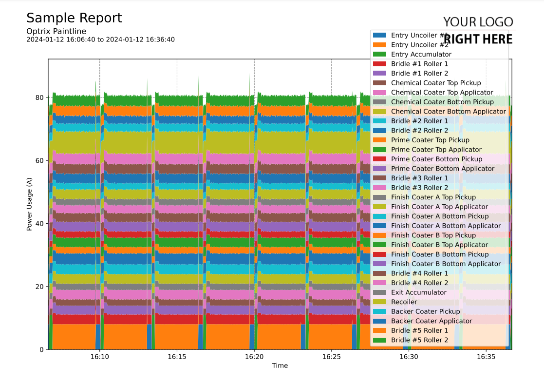
This code sample of a area chart report.
This creates a stacked area chart of all of your assets with a particular property.
Then for each moment in time, it shows the value found in each asset. By stacking your values on top of one-another, you see not only the total amount, but how much each individual item contributed to that total.
Customising
| Element | Replace With |
|---|---|
| [PROPERTY] | The name of the property you want to report on |
| [MEASUREMENT] | The name of the measurement (ie. Temperature) |
| [UNIT] | The units the measurement is in |
The Code
import os
import sys

sys.path.insert(0,os.path.dirname(os.path.dirname(__file__)))

import mplreport
import datetime

@mplreport.ardireport("Sample Report")
def CreateReport(report,args):

    #Create a page containing a single plot.
    fig,ax = report.CreatePage(1)

    #Print a title block for the page.
    report.Title()

    #Our AQL query goes here
    query = "('[PROPERTY]') PROPERTY ALLPOINTS"

    #Get the pandas data-frame with the results.
    df = report.GetHistory(query)

    #The cumulative totals so far, so we can draw the next area above the previous one.
    sofar = [0] * len(df.index)

    #Draw the area chart
    for col in df.columns:
        values = df[col] + sofar
        ax.fill_between(df.index,sofar,values,label=col.replace(" [PROPERTY]",""))
        sofar = values

    #Set the minimum Y value to 0
    ax.set_ylim(0)

    #Clean up and prettify
    ax.margins(x=0)
    ax.set_xlabel("Time")
    ax.set_ylabel("[MEASUREMENT] ([UNIT])")
    ax.legend(loc='lower right')

    report.TimeAxis(ax.xaxis)
    report.Grid(ax)

    #Save this report out.
    report.Save()
