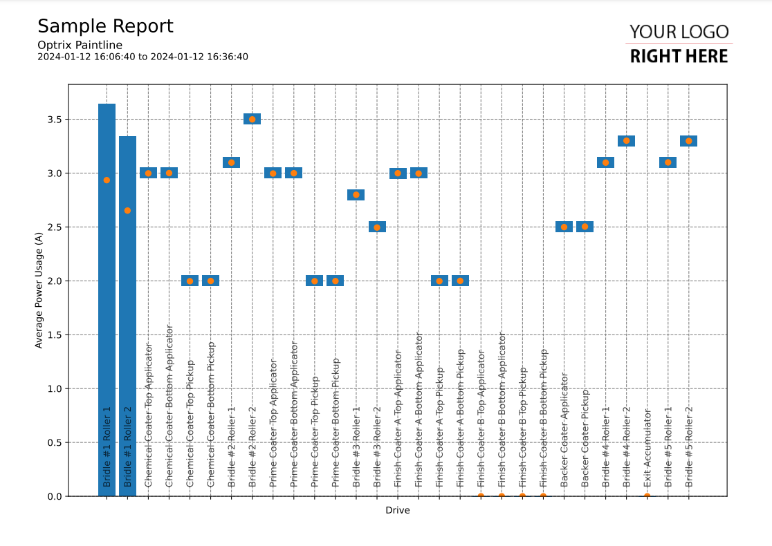
Min/Max Vertical Bar Chart
This code sample of a vertical bar chart report.
It shows the minimum, maximum and average values of a single property across multiple assets. It uses a relationship to define the order that the assets appear in across the X axis.
Asset names vary wildly in terms of length. Because of this, we suggest placing your asset names inside the report rather than placing them on one of your axes.
This report is an example of combining two styles of report on a single axis - it uses a vertical bar chart to create the ranges, and a scatter plot to indicate the averages.
By default, ARDI returns interpolated results when you request values across a time frame. This means that over larger ranges, very small peaks or troughs might be 'averaged out'.
If you want to ensure accurate minimum and maximum values, you should request history with a mode of 'min' or 'max' to ensure you've captured the genuine minimums and maximums.
Customising
| Element | Replace With |
|---|---|
| [ASSET] | The asset you want to start with |
| [RELATIONSHIP] | The relationship that defines the order of the assets |
| [PROPERTY] | The name of the property you want to report on |
| [MEASUREMENT] | The name of the measurement (ie. Temperature) |
| [UNIT] | The units the measurement is in |
The Code
import os
import sys

sys.path.insert(0,os.path.dirname(os.path.dirname(__file__)))

import mplreport
import datetime

@mplreport.ardireport("Sample Report")
def CreateReport(report,args):

    #Create a page containing a single plot.
    fig,ax = report.CreatePage(1)

    #Print a title block for the page.
    report.Title()

    #Our AQL query goes here
    query = "'[ASSET]' ASSET '[RELATIONSHIP]' RELATIONSHIP 'downi' RELATED ('[PROPERTY]') PROPERTY VALUES"

    #Get the pandas data-frame with the results.
    df = report.GetHistory(query)

    #Get the minimum and maximums. A single sample, for the whole report range.
    dfmin = report.GetHistory(query,method='min',samples=1)
    dfmax = report.GetHistory(query,method='max',samples=1)

    #Draw the bar chart
    ax.bar(range(0,len(df.columns)),dfmax.iloc[0] - dfmin.iloc[0],bottom=dfmin.iloc[0])

    #Draw the averages
    ax.scatter(range(0,len(df.columns)),df.mean())

    #Draw in names
    indx = 0
    for col in df.columns:
        ax.text(indx - 0.18, 0.1, col.replace(" Current - Armature","").strip(), rotation=90, c=(0,0,0,0.7))
        indx += 1

    #Clear the X axis
    ax.set_xticks(range(0,len(df.columns)))
    ax.set_xticklabels([""] * len(df.columns))

    #Set the minimum Y value to 0
    ax.set_ylim(0)

    #Clean up and prettify
    ax.set_xlabel("[RELATIONSHIP]")
    ax.set_ylabel("[MEASUREMENT] ([UNIT])")
    report.Grid(ax)

    #Save this report out.
    report.Save()
