Example Utilisation Displays
With all of these displays, you can click on any part of the data to navigate to other visualisations.
Treemap
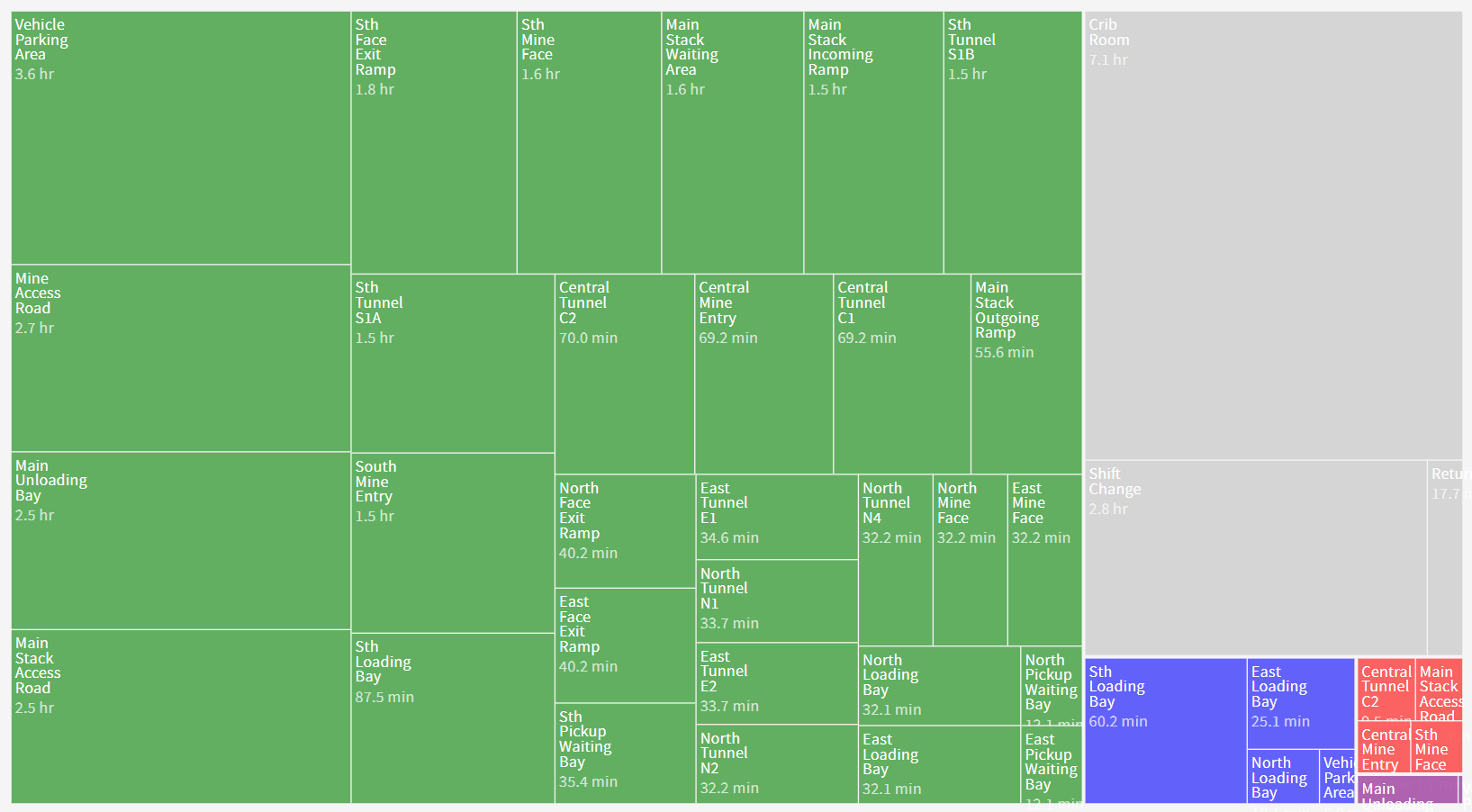
The treemap shows how much time has been consumed across all of your resources.
You can click on the legend to turn individual types of status on or off (for example, hiding the 'good' statuses to show only the undesirable ones).
You can also use the drop-list in the top-left corner to choose between looking at the Total Time, Number of Events and Average Time.
State Leading Causes
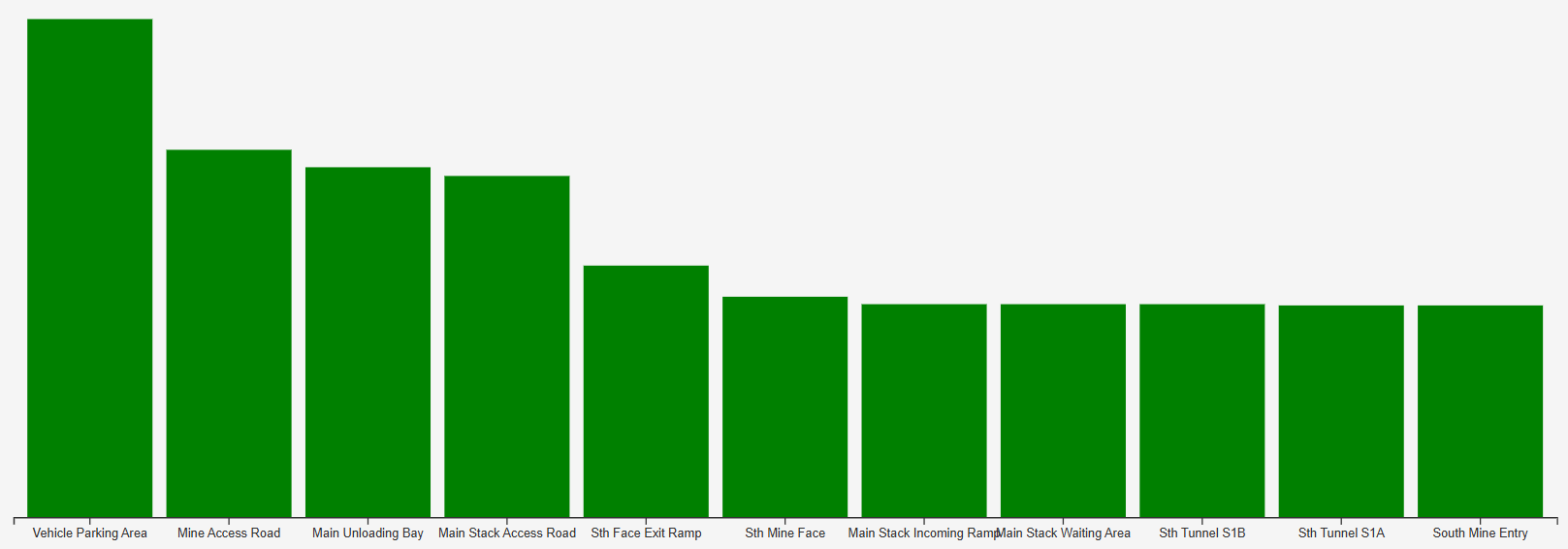
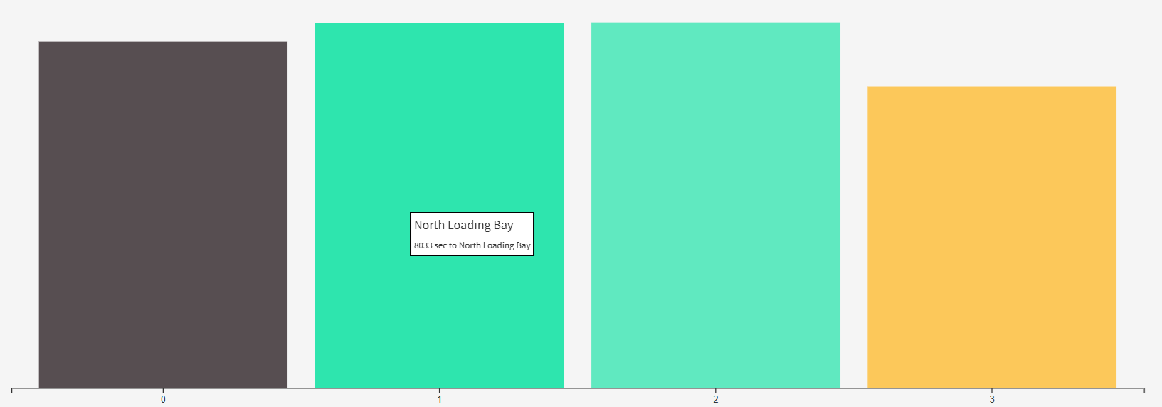
These bar charts show which states your resources have been spending time in, with a focus on a single type of state.
You can also use the drop-list in the top-left corner to choose between looking at the Total Time, Number of Events and Average Time.
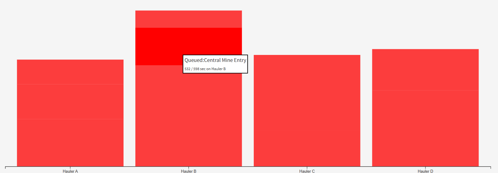
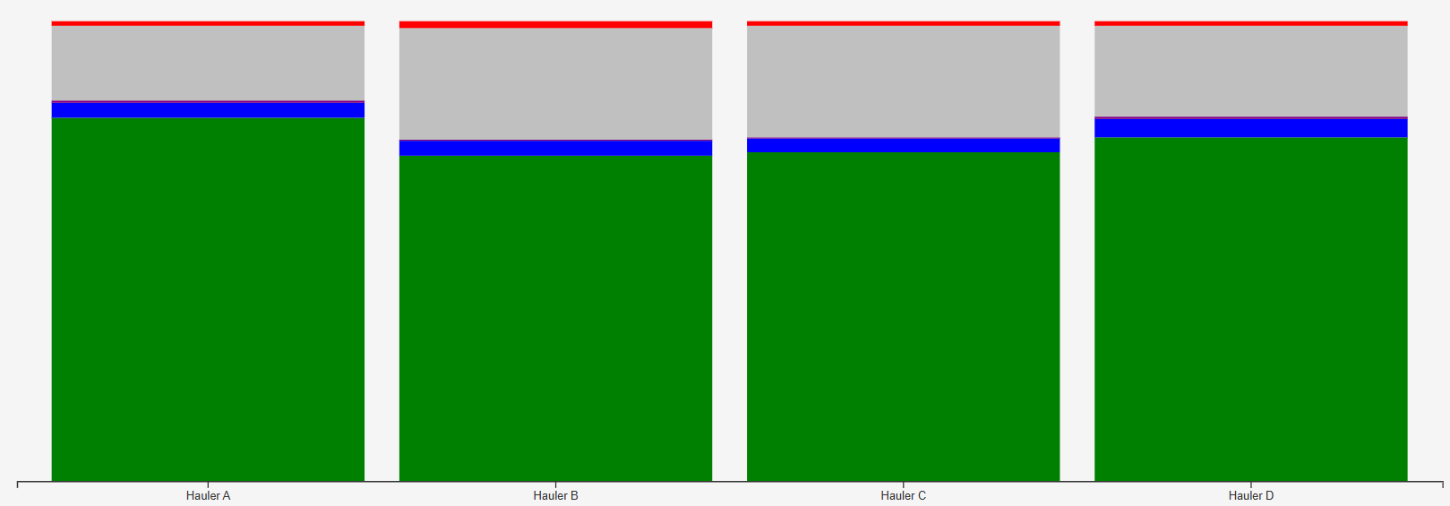
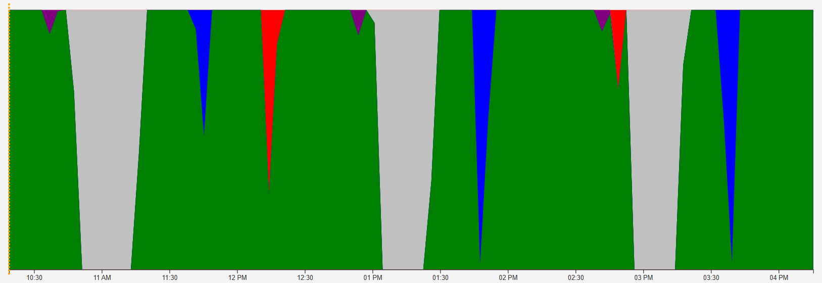
Asset State Distribution
Cross-Asset Distribution
Cycle Timing
If configured, you may also be able to review cycle timing. This records how long assets have taken to complete 'cycles', such as performing a repetitive task, batch or journey.
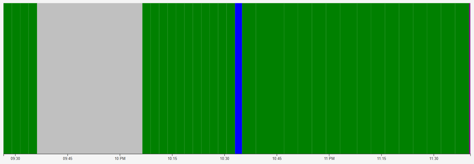
Timeline
Zooms in on the moment-by-moment status of a resource - normally used to visualise the activities during a single cycle.
