PCC Charts
Parallel Coordinate Charts are used to compare how values are spread across a number of points at a single time.
They're used when you have too many different measurements for a scatter plot to be useful. In particular, when your points have different ranges, as scatter-plots are only useful when your measurements share a similar minimum and maximum value.
They're like a line chart, but the ticks on the X axis represent different measurement points instead of times.
Each item on the X axis has it's own unique scale, meaning that assets with radically different scales can be directly compared to one-another.
Each line on a PCC chart represents a single moment in time. For example, one line will show the values for each point at 08:00, while the next will show the values at 08:02.
Example
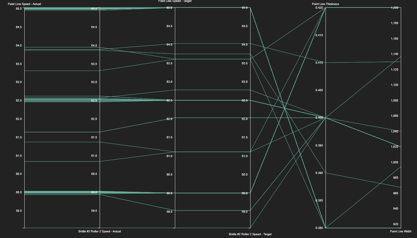
The chart below is comparing 6 points on our Paint Line - a system that runs a product of varying thickness and width through rollers.
| Points (From Left to Right) |
|---|
| Paint Line Actual Speed |
| Roller Actual Speed |
| Paint Line Target Speed |
| Roller Target Speed |
| Product Thickness |
| Product Width |
You can see that each asset has it's own unique Y axis. This lets us directly compare properties like speed - measured in meters-per-minute - with thickness, which is measured in millimeters.
Remembering that each line is a different point in time, we can see that generally the target and actual speeds tend to stay quite close together, with the actual speeds showing more movement and noise than the target speeds, but both are sticking fairly close together.
The product thickness appears to be the inverse of our speed. The greater the speed, the lower the thickness. In this case, it indicates that the line has to run thicker products slower.
The product width is less strongly related than the other values. This indicates that it might not be directly related to the other measurements, or that it's relationship is complex.
