Limit and Control UI
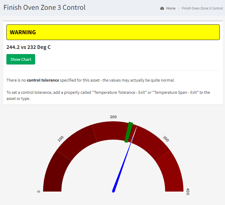
When you click on an Limit or Control test in FirstSite, you'll be taken to a web page that looks like the one below…
Test Results
At the top of the page are your test results, showing you if the asset is running in an unusual way.
In most cases, you want this to be green (OK), indicating its under control.
Yellow indicates that it's mildly out of control, while red indicates it's severely out of control.
In the example above, it's yellow - indicating that the value has drifted outside the acceptable range.
View Chart
You can press the View Chart button to open Data Explorer, showing the key values over time.
Chart
The chart below is a simple gauge showing the measured value (the blue needle) pointing towards the target range (the green arc across the top of the gauge).
