Cupcake Example
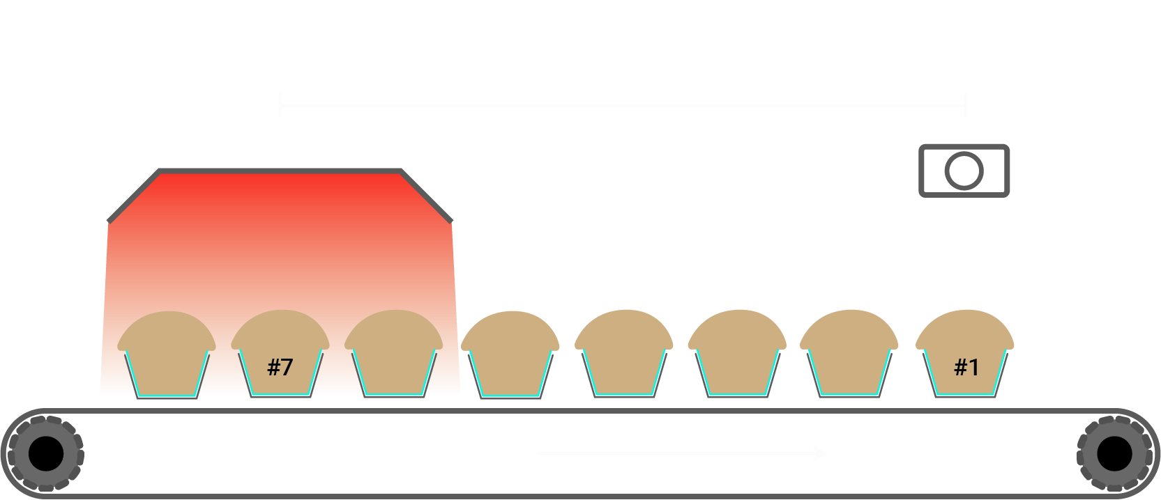
In this case, we're going to ask for both the oven temperature and final colour on a cupcake-making machine. These two pieces of equipment are 50m apart from one-another.
Example Chart
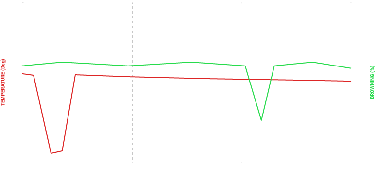
This is what a chart of our temperature and colour values looks like at the moment. Thanks to the distance between the two components, there's a significant amount of lag between the readings from the oven compared to the readings from the inspection station.
If we wanted to report on cupcake quality and get insight into why the quality was low, we can make this much clearer by compensating for the lag.
Identify Key Elements
First, we determine the source of our lag. The real source is distance. To compensate for the distance between our assets, we need either a counter or a rate that reflects the distance moved by our conveyor.
The speed of the conveyor is perfect for this - it's a rate of distance over time.
Next, we determine our end asset. In this case, the last asset in the system is the Inspection Section.
Finally, we want to measure our distances between each asset and our end asset. From the diagram at the top of the page, we can see that the distance between the Oven and the Inspection Station is 50m.
The Code
srv = ardiapi.Server('cupcake.ardi')

lcq = samplestream.LagCorrectedQuery(srv)
lcq.RateLagQuery('Meters',"'Conveyor' ASSET 'Speed' PROPERTY VALUES")
lcq.AddQuery("'Inspection Station' ASSET 'Brownness' PROPERTY VALUES")
lcq.AddQuery("'Oven' ASSET 'Temperature' PROPERTY VALUES",lag=50)
lcq.multiplier = 0.0166
lcq.shavems = True

starttime = datetime.datetime.utcnow()-datetime.timedelta(seconds=60*60)
endtime = datetime.datetime.utcnow()

df = lcq.Execute(starttime,endtime,samples=3600)
Key Functions
lcq.RateLagQuery('Meters',"'Conveyor' ASSET 'Speed' PROPERTY VALUES")
This line tells the class that we are going to correct for lag based on the Speed property from our Conveyor. This is a rate of change, so we'll use the RateLagQuery function.
lcq.AddQuery("'Inspection Station' ASSET 'Brownness' PROPERTY VALUES")
This line adds a query for the 'brownness' of our cupcakes, measured at the Inspection Station. This station is our end asset (the machine at the end of our process), so we won't include a lag for it.
lcq.AddQuery("'Oven' ASSET 'Temperature' PROPERTY VALUES",lag=50)
This line adds another query, this time for the Oven. In this case, we've added a lag of '50' - the distance in meters between the the inspection station and the ovens.
We then send a request for the last hour of data.
The Results
In our results, we get the following…
| Meters | Inspection Darkness | Oven Temp |
|---|---|---|
| 0.0 | 60% | 132.1 |
| 1.2 | 62% | 132.0 |
| 2.4 | 61% | 131.9 |
| 3.6 | 60% | 131.8 |
| 4.8 | 55% | 120.7 |
| 6.0 | 62% | 131.6 |
You'll notice that you don't have a time index anymore in the resulting dataframe. Instead, you've got a total amount of the source of lag seen (in this case, it's meters of conveyor-belt).
What It Means
Reading our original chart, people may suspect that there's a direct relationship between the two dips, but it requires technical knowledge and very clean data to be confident.
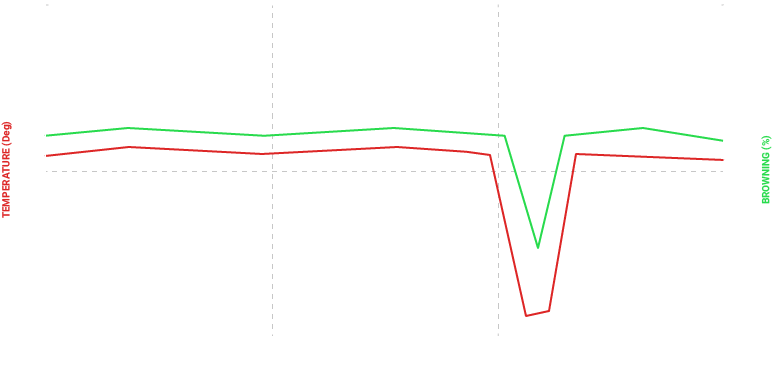
But after lag compensation, our chart looks like this…
Each of the values are synchronised - so when meters is 0, the level of browning and the oven temperature are for Cupcake #1, even though those two points were measured minutes apart.
Looking at the data, you'll see a drop after 4.8m. Both the darkness and oven temperature decreased. This makes the correlation extremely obvious.
It also helps when dealing with noisy data. Variables are often influenced by a variety of different factors, which makes spotting root-causes difficult. But by correcting for lag, these relationships become much clearer, even for people unfamiliar with your system.
Going Further
You can extend this even more by using ARDIs relationships and storing the distance between assets in ARDI itself.
See an example of an adaptable solution for details.


