Heatmap Reports
When creating a report, we found that there were simply too many channels of data to display everything on a single line chart.
One way of resolving this is by splitting our individual channels up into their own charts.
This is ideal if you're looking for issues along individual assets. But if you're looking for patterns or inconsistencies across your assets, a heatmap is often a better option.
Picking a Resolution
Normally, heatmaps are at a slightly lower time-resolution compared to line graphs. We find that 500-1000 time-samples across your X axis is very readable for users.
To do this, you can set the samples parameter in the call to GetHistory.
df = report.GetHistory(query,samples=500)
Choosing a Colour Scale
One question that comes up with heatmaps is what colour scale to use for the data. One of the best scales to use is known as viridis, specifically designed to give a good impression of a value, even for people with common colour-vision issues (such as red-green colour-blindness).
But some ARDI analogue points include their own distinct colour-map, used to highlight issues at specific value thresholds (ie. green in good ranges, blue when low and red when high).
If we call FetchHistory instead of GetHistory, we also have access to the ARDI metadata as well as the pandas DataFrame.
With the metadata available, we can use the GetAnalogColourMap function to return an array made up of…
| Element | Content |
|---|---|
| 0 | A MatPlotLib colour map |
| 1 | The minimum value of the range |
| 2 | The maximum value of the range |
    #Get the pandas data-frame with the results.
    hist = report.FetchHistory(query,samples=500)
    df = hist.data

    #Get a colour map, minimum and maximum value from the column information
    map = report.GetAnalogColourMap(hist,df.columns[0])
Building the Heatmap
    #Draw the heatmap itself
    im = ax.imshow(df.T,cmap=map[0],interpolation='nearest',aspect='auto',vmin=map[1],vmax=map[2])

    #Clean up and prettify
    ax.set_ylabel("Turbine")
    ax.set_xlabel("Time")
    ax.margins(0,0)
    report.HeatMapTimeAxis(ax.xaxis,500)
This takes advantage of the HeatMapTimeAxis function, which is used to convert a sequence of numbers something that looks like a time axis.
Adding a Colour Legend
The following code creates a colour bar on the right-hand side of your report, describing the values that your different colours represent.
    #Draw a reference scale
    cbar = ax.figure.colorbar(im, ax=ax)
    cbar.ax.set_ylabel("Vibration (mm/s/s)", rotation=-90, va="bottom")
The Y Axis
One issue with the default appearance of a heatmap report is the labels on the Y axis. Showing the names of the assets outside the axes squashes your heatmap quite a lot.
The code below places the axis labels on the inside of the axes instead.
    #Draw in names
    indx = len(df.columns)-1
    for col in df.columns:
        ax.text(2,indx+0.18,col.replace(" Vibration","").strip(), c=(0.5,0.5,0.5,0.6))
        indx -= 1

    #Clear the X axis
    ax.set_yticks(range(0,len(df.columns)))
    ax.set_yticklabels([""] * len(df.columns))
Results
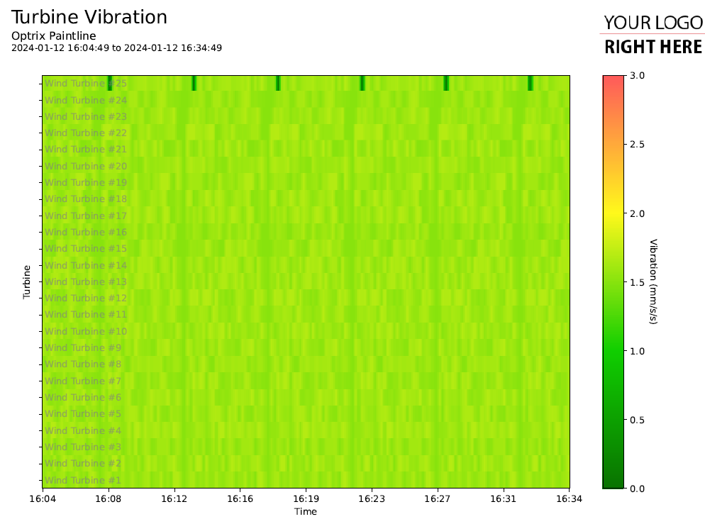
This gives us a heatmap of the vibration across each of our wind turbines.
You can find more report examples here.
Now that we've build a report, why not try an less traditional style of report?
