Creating a Traditional Report
In this example, we're going to create a traditional PDF report that can be emailed or printed to our users.
Our Task
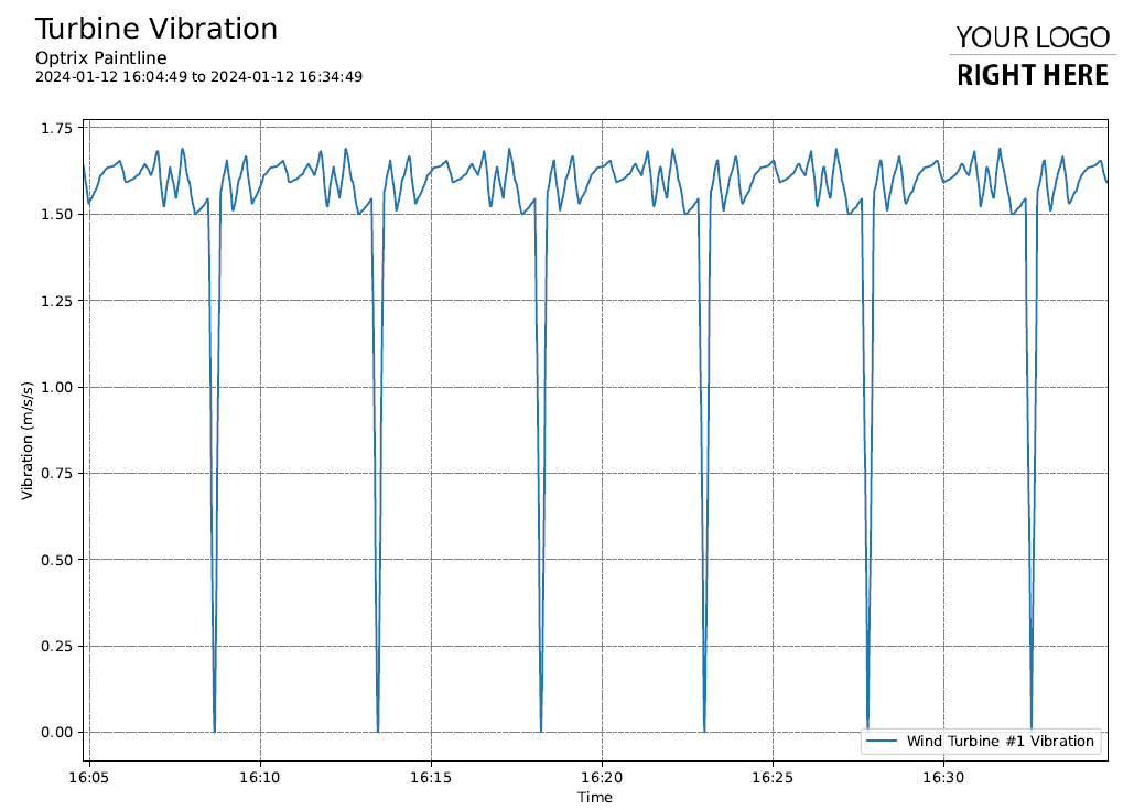
Our users need to see a daily line-graph showing how much vibration we're getting on our wind turbines.
Requirements
To follow this exercise, you'll need to download our bundle of examples.
You'll also need to install Python and some modules before your code will work.
A working knowledge of the Python language will be useful.
If you're making PDFs, ARDI provides some tools to quickly develop custom reporting using the MatPlotLib library. You are not limited to using our libraries - you can use any tools you like, as long as you output a suitable file before the script finishes.
Step 1: Identify the Assets & Build a Query
We will use a modified version of the query we created earlier when we brought into Excel.
'Wind Turbine #1' ASSET 'Sequence' RELATIONSHIP 'downi' RELATED 'Vibration' PROPERTY VALUES
This query gets each of our wind turbines - in order - and reads the 'Vibration' property from them
Step 2: Copy A Basic Report
Extract the contents of the report example package you downloaded earlier to a folder on your computer.
In it, you'll find a folder called reports.
It contains a folder called sample that includes a single very basic report. Make a new copy of that folder and name it vibration.
Step 3: Update the Code
In your new folder you'll find a file called report.py. Open it in your preferred code editor (we suggest IDLE (installed with Python on Windows) or Visual Studio.
import os
import sys
sys.path.insert(0,os.path.dirname(os.path.dirname(__file__)))
import mplreport
import datetime

@mplreport.ardireport("Sample Report")
def CreateReport(report,args):

    #Our AQL query goes here
    query = "'Bridle #1 Roller 1' ASSET 'Current - Armature' PROPERTY VALUES"

    #Get the pandas data-frame with the results.
    df = report.GetHistory(query)

    #Create a page containing a single plot.
    fig,ax = report.CreatePage(1)

    #Print a title block for the page.
    report.Title()

    k = df.columns[0]
    ax.plot(df[k],label=k)

    #Clean up and prettify
    ax.margins(x=0)
    ax.set_xlabel("Time")
    ax.set_ylabel("Current (A)")
    ax.legend(loc='lower right')

    report.TimeAxis(ax.xaxis)
    report.Grid(ax)

    #Save this report out.
    report.Save()
This report already happens to display a line chart and uses the mplreport library to set everything up. The main things we need to do are…
* Update the Title
* Change the Query
* Change the Y Axis Title
Updating the Title
Look for the following line…
@mplreport.ardireport("Sample Report")
You can update the reports title by changing the text “Sample Report” to the name you'd like to appear at the top of the report. For example, “Turbine Vibration”.
Changing the Query
Find this line…
query = "'Bridle #1 Roller 1' ASSET 'Current - Armature' PROPERTY VALUES"
Paste the query from the top of this page over the query.
Changing the Y Axis Label
Find this line…
ax.set_ylabel("Current (A)")
And change the text 'Current (A)' to 'Vibration (m/s/s)'
Running The Report
NOTE: This section is normally taken care of by the ARDI UI, which allows users to search through reports, create custom time ranges and also helps to schedule, bundle and either email or publish your reports so they reach your users.
When the report isn't running from an ARDI server, you'll need to launch it manually.
There's a file called run.bat that Windows users can double-click to generate a report. It sends the report all of the command-line parameters (start time, end time, server name, timezone, report name etc.) that would normally be sent from the ARDI user interface.
The file includes a hard-coded path to C:\Python310\python - you might need to edit that path (or remove the 'C:\Python310') if you've install Python to a different directory.
If everything works, a file named generated.pdf and generated.png should be created.
Where Are All The Turbines?
The code we copied only allows us to see the first column of the data we requested from ARDI.
If we look at the part of the code that actually draws things, you'll see this…
    k = df.columns[0]
    ax.plot(df[k],label=k)
Your query data is returned as a Pandas DataFrame. These represent tables of data, and Pandas allows you to do a lot of really fast, useful analytic operations.
Right now, we're getting the name of the first column and only drawing a line for that one column. To show all of our channels of data, we need to change this code.
   for c in df.columns:
        ax.plot(df[c],label=c)
Try running the report. If you see an error message, make sure you've closed the previous report - it can't overwrite a file if you've got it open in Adobe Acrobat.
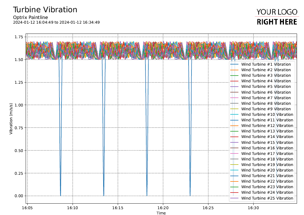
Ahhh! Now That's Too Much!
Open the file to see a working but very messy report.
Line charts begin to be difficult to read once there are more than three or four different lines, particularly if the information is noisy and they cross one-another.
Options we can explore include…
Multi-Section & Multi-Page Reports, or perhaps a Heatmap Reports.

