Multi-Section & Multi-Page Reports
When creating a report, we found that there were simply too many channels of data to display everything on a single line chart.
One way of resolving this is by splitting our individual channels up into their own charts.
But since there are so many, we'll also need to split these charts across multiple pages.
Choosing the Charts Per Page
First, lets decide on the number of charts per page.
As a guide, we usually suggest having no more than three (3) charts shown vertically on any one A4 or Letter-sized page - otherwise they get small and difficult to read.
Creating Pages With Three Subplots
The CreatePage call adds a page to a report. It takes the same arguments as the MatPlotLib subplot function.
If you pass a number as the first parameter, your report will be broken into that many vertical sub-plots. These sub-plots are returned in an array that is the second part of the tuple returned by CreatePage.
The Report Logic
    #Count the number of plots
    plotid = 0

    #For each column...
    for c in df.columns:
        #Create a new page if this is the 4th item..
        if plotid >= 3:
            fig,axes = report.CreatePage(3)
            report.Title()
            plotid = 0

        #Draw the line and make the margins pretty
        axes[plotid].plot(df[c],label=c)
        axes[plotid].margins(x=0)
        axes[plotid].set_ylabel("Vibration (m/s/s)")
        axes[plotid].legend(loc='lower right')
        report.TimeAxis(axes[plotid].xaxis)
        report.Grid(axes[plotid])
        plotid += 1

    #Remove the axes on the remaining subplots
    if plotid < 2:
        for n in range(plotid,3):
            axes[n].set_axis_off()
Results
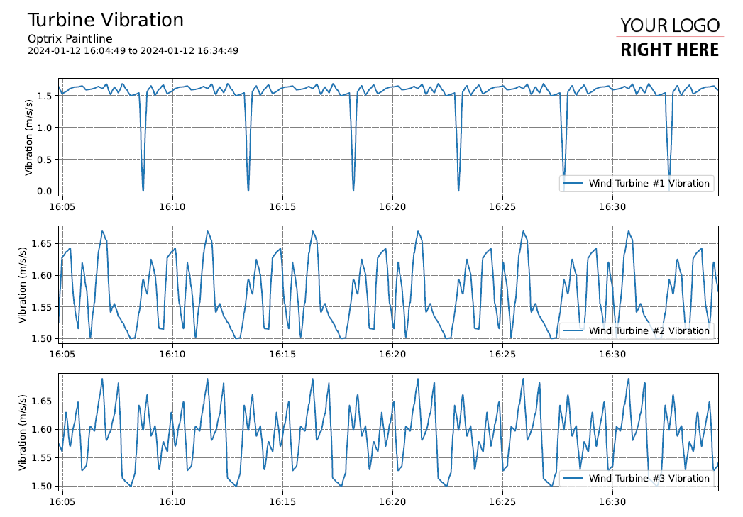
This gives us a page filled with individual charts for each wind turbine.
If the issue is more around looking for patterns across and between your points, you can try a heatmap report.
